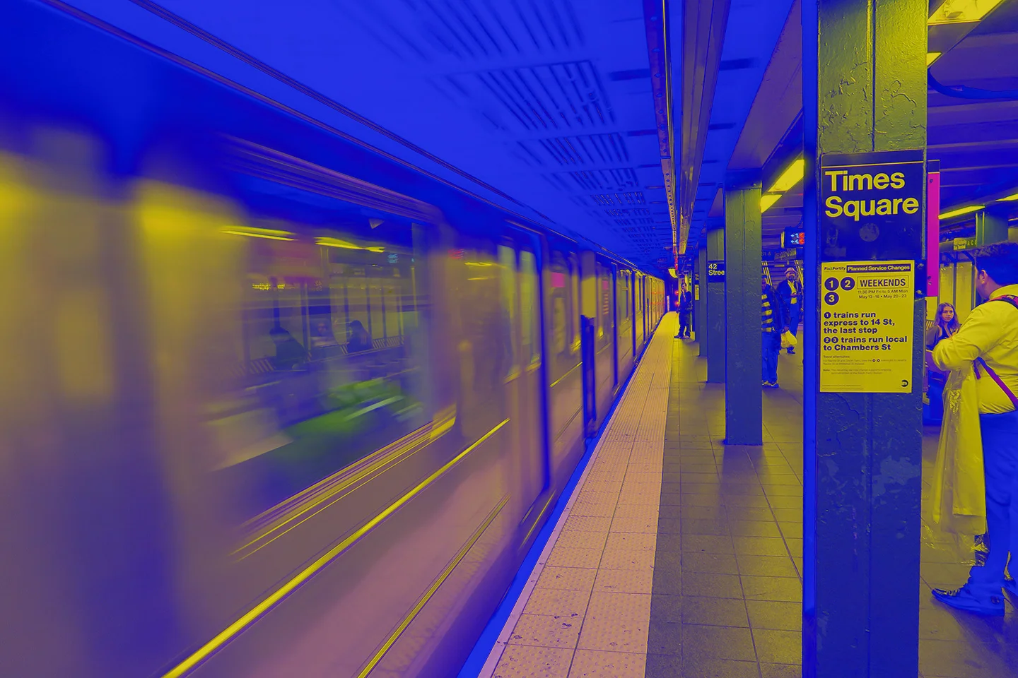
Colour effects with CSS blend-mode – no Photoshop required. The article image shows you a photo where the effect was still created the traditional way in Photoshop. But for the web there is a better approach: you can achieve the same or very similar effects with CSS alone – without Photoshop or any other software.
How does CSS blend-mode work?
(1.) Choose the photo you want to embed in your website.
(2.) Use HTML markup to embed the image as a background image on your page. You can do this with a div element, as shown in the example below.
<div class="blendmode_image"></div>The important thing is to assign a class to the div element. In our case we call the class blendmode_image.
(3.) Now comes the relevant CSS. We give the div element a size. The image itself is defined as a background image, and an effect colour of your choice is set. Finally, the actual effect is applied.
.blendmode_image {
  max-width: 1440px;
  height: 960px;
  background-image: url('../path/to/your/image.jpg');
  background-size: cover;
  background-position-x: center;
  background-color: #2139ec;
  background-blend-mode: difference;
}
And that’s really all there is to it. Besides difference, the blend-mode property supports the following additional effects:
- color
- color-burn
- color-dodge
- darken
- difference
- exclusion
- hard-light
- hue
- lighten
- luminosity
- multiply
- overlay
- saturation
- screen
- softlight
(4.) The whole thing now looks like this:
Pretty cool, isn’t it? With just a few lines of HTML and CSS you can create image effects quickly and easily.